Gradientes em CSS
Os gradientes CSS mostram transições progressivas entre duas ou mais cores especificadas. Conheça os tipos de gradientes, a sua utilização e veja muitos exemplos.
Os gradientes CSS mostram transições progressivas entre duas ou mais cores especificadas. Os gradientes podem ser utilizados em fundos.
Existem três tipos de gradientes:
Gradientes lineares
O linear-gradient cria uma imagem que consiste numa transição suave entre duas ou mais cores ao longo de uma linha reta. Pode ter um ponto de partida e uma direção, juntamente com o efeito de gradiente.
Sintaxe
A sintaxe do gradiente linear
background-image: linear-gradient(direction, color1, color2, ...);De cima para baixo
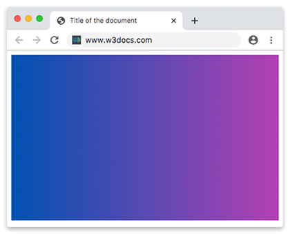
Por predefinição, os gradientes lineares fazem a transição de cima para baixo.
Exemplo de um gradiente linear de cima para baixo:
gradiente linear de cima para baixo
<!DOCTYPE html>
<html>
  <head>
    <title>Title of the document</title>
    <style>
      .gradient {
        height: 300px;
        background-color: blue;
        background-image: linear-gradient(#0052b0, #b340b3);
      }
    </style>
  </head>
  <body>
    <div class="gradient"></div>
  </body>
</html>Adicionamos a propriedade background-color para os browsers que não suportam gradientes.
Da esquerda para a direita
Altera a rotação de um linear-gradient especificando a direção que começa à esquerda e faz a transição para a direita.
Exemplo de um gradiente linear da esquerda para a direita:
gradiente linear da esquerda para a direita
<!DOCTYPE html>
<html>
  <head>
    <title>Title of the document</title>
    <style>
      .gradient {
        height: 300px;
        background-color: blue;
        background-image: linear-gradient(to right, #0052b0 ,#b340b3);
      }
    </style>
  </head>
  <body>
    <div class="gradient"></div>
  </body>
</html>Gradientes diagonais
Os gradientes podem decorrer na diagonal especificando as posições de partida horizontal e vertical. Começa no canto superior esquerdo e vai até ao canto inferior direito.
Exemplo do gradiente diagonal:
gradiente diagonal CSS
<!DOCTYPE html>
<html>
  <head>
    <title>Title of the document</title>
    <style>
      .gradient {
        height: 300px;
        background-color: blue;
        background-image: linear-gradient(to bottom right, #0052b0, #b340b3);
      }
    </style>
  </head>
  <body>
    <div class="gradient"></div>
  </body>
</html>Utilizar ângulos
Defina um ângulo em vez de direções para ter mais controlo sobre a direção do gradiente. 0deg cria um gradiente vertical que faz a transição de baixo para cima, 90deg cria um gradiente horizontal que faz a transição da esquerda para a direita. Especificar ângulos negativos faz com que o gradiente decorra no sentido anti-horário.
Exemplo de um gradiente linear com um ângulo especificado:
gradiente linear utilizando ângulo
<!DOCTYPE html>
<html>
  <head>
    <title>Title of the document</title>
    <style>
      .gradient {
        height: 300px;
        background-color: blue;
        background-image: linear-gradient(70deg, #0052b0, #b340b3);
      }
    </style>
  </head>
  <body>
    <div class="gradient"></div>
  </body>
</html>Efeito de várias cores
As cores dos gradientes CSS variam consoante a posição, produzindo transições de cor suaves. Não há limite na utilização de cores.
Exemplo de um gradiente linear com efeito de várias cores:
gradiente linear com várias cores
<!DOCTYPE html>
<html>
  <head>
    <title>Title of the document</title>
    <style>
      .gradient {
        height: 300px;
        background-color: blue;
        background-image: linear-gradient(#f50707, #f56e00,#f7df00, #66f507, #0052b0, #520f41, #ff0856);
      }
    </style>
  </head>
  <body>
    <div class="gradient"></div>
  </body>
</html>Também podemos criar um gradiente linear com efeito de várias cores especificando uma direção. Pode atribuir a cada cor zero, um ou dois valores de percentagem ou de comprimento absoluto. 0% indica o ponto de partida, enquanto 100% indica o ponto final.
Exemplo de um gradiente linear com várias cores da esquerda para a direita:
gradiente linear da esquerda para a direita com várias cores
<!DOCTYPE html>
<html>
  <head>
    <title>Title of the document</title>
    <style>
      .gradient {
        height: 300px;
        background-color: blue;
        background-image: linear-gradient(to right, #f50707, #f56e00,#f7df00, #66f507, #0052b0, #520f41, #ff0856);
      }
    </style>
  </head>
  <body>
    <div class="gradient"></div>
  </body>
</html>Exemplo de um gradiente linear com várias cores da direita para a esquerda:
gradiente linear da direita para a esquerda com várias cores
<!DOCTYPE html>
<html>
  <head>
    <title>Title of the document</title>
    <style>
      .gradient {
        height: 300px;
        background-color: blue;
        background-image: linear-gradient(to left, #f50707, #f56e00,#f7df00, #66f507, #0052b0, #520f41, #ff0856);
      }
    </style>
  </head>
  <body>
    <div class="gradient"></div>
  </body>
</html>Transparência
Os gradientes suportam transparência, pelo que pode utilizar vários fundos para obter um efeito transparente. Para o conseguir, pode utilizar a função rgba() para definir os color stops. O último parâmetro da função rgba() pode ser um valor de 0 a 1, que define a transparência da cor. 0 indica transparência total, 1 indica cor total.
Exemplo de um gradiente linear de cor total a transparente:
gradiente linear transparente
<!DOCTYPE html>
<html>
  <head>
    <title>Title of the document</title>
    <style>
      .gradient {
        height: 200px;
        background-image: linear-gradient(to left, rgba(235, 117, 253, 0), rgba(235, 117, 253, 1));
      }
    </style>
  </head>
  <body>
    <div class="gradient"></div>
  </body>
</html>Gradiente linear repetido
Utilize a função repeating-linear-gradient() para repetir um gradiente linear. As cores são repetidas ciclicamente à medida que o gradiente se repete.
Exemplo de um gradiente linear repetido:
gradiente linear repetido
<!DOCTYPE html>
<html>
  <head>
    <title>Title of the document</title>
    <style>
      .gradient {
        height: 200px;
        background-color: blue;
        background-image: repeating-linear-gradient(55deg, #d5b6de, #6c008a 7%, #036ffc 10%);
      }
    </style>
  </head>
  <body>
    <div class="gradient"></div>
  </body>
</html>Gradientes radiais
Os gradientes radiais irradiam a partir de um ponto central. Para criar um gradiente radial, é necessário especificar pelo menos dois color stops. Os gradientes radiais podem ser circulares ou elípticos.
Sintaxe
Sintaxe do gradiente radial
background-image: radial-gradient(shape size at position, start-color, ..., last-color);Exemplo de um gradiente radial com três cores:
gradiente radial CSS
<!DOCTYPE html>
<html>
  <head>
    <title>Title of the document</title>
    <style>
      .gradient {
        height: 250px;
        width: 250px;
        background-color: blue;
        background-image: radial-gradient( #ff0509, #fff700, #05ff33);
      }
    </style>
  </head>
  <body>
    <div class="gradient"></div>
  </body>
</html>Posicionar os color stops radiais
Tal como os gradientes lineares, os gradientes radiais também aceitam uma posição especificada e um comprimento absoluto.
Exemplo de color stops com espaçamentos diferentes:
color stops posicionados do gradiente radial
<!DOCTYPE html>
<html>
  <head>
    <title>Title of the document</title>
    <style>
      .gradient {
        height: 250px;
        width: 250px;
        background-color: blue;
        background-image: radial-gradient( #ff0509 10%, #fff700 20%, #05ff33 80%);
      }
    </style>
  </head>
  <body>
    <div class="gradient"></div>
  </body>
</html>Posicionar o centro do gradiente radial
Também pode especificar a posição do centro do gradiente com percentagens ou comprimentos absolutos.
Exemplo de um gradiente radial com centro posicionado:
centro posicionado do gradiente radial
<!DOCTYPE html>
<html>
  <head>
    <title>Title of the document</title>
    <style>
      .gradient {
        height: 250px;
        width: 250px;
        background-color: blue;
        background-image: radial-gradient(at 0% 30%, #ff0509 10px, #fff700 30%, #05ff33 50%);
      }
    </style>
  </head>
  <body>
    <div class="gradient"></div>
  </body>
</html>Forma do gradiente radial
O parâmetro shape define a forma do gradiente radial. Pode assumir dois valores: circle ou ellipse. O valor predefinido é ellipse.
Exemplo de forma do gradiente radial:
gradiente radial CSS circular e elíptico
<!DOCTYPE html>
<html>
  <head>
    <title> Title of the document</title>
    <style>
      .gradient1 {
        height: 150px;
        width: 200px;
        background-color: blue;
        background-image: radial-gradient(red, yellow, green);
      }
      .gradient2 {
        height: 150px;
        width: 200px;
        background-color: blue;
        background-image: radial-gradient(circle, red, yellow, green);
      }
    </style>
  </head>
  <body>
    <h2>Ellipse:</h2>
    <div class="gradient1"></div>
    <h2>Circle:</h2>
    <div class="gradient2"></div>
  </body>
</html>Dimensionar o gradiente radial
Ao contrário dos gradientes lineares, o tamanho dos gradientes radiais pode ser especificado. Os valores são:
- closest-corner
- closest-side
- farthest-corner (predefinição)
- farthest-side.
Exemplo de gradientes radiais com tamanho especificado:
gradiente radial CSS closest-corner, closest-side, farthest-corner e farthest-side
<!DOCTYPE html>
<html>
  <head>
    <title>Title of the document</title>
    <style>
      .gradient1 {
        height: 150px;
        width: 150px;
        background-color: blue;
        background-image: radial-gradient(closest-side at 60% 55%, #ff0509, #fff700, #103601);
      }
      .gradient2 {
        height: 150px;
        width: 150px;
        background-color: blue;
        background-image: radial-gradient(farthest-side at 60% 55%, #ff0509, #fff700, #103601);
      }
      .gradient3 {
        height: 150px;
        width: 150px;
        background-color: blue;
        background-image: radial-gradient(closest-corner at 60% 55%, #ff0509, #fff700, #103601);
      }
      .gradient4 {
        height: 150px;
        width: 150px;
        background-color: blue;
        background-image: radial-gradient(farthest-corner at 60% 55%, #ff0509, #fff700, #103601);
      }
    </style>
  </head>
  <body>
    <h2>closest-side:</h2>
    <div class="gradient1"></div>
    <h2>farthest-side:</h2>
    <div class="gradient2"></div>
    <h2>closest-corner:</h2>
    <div class="gradient3"></div>
    <h2>farthest-corner:</h2>
    <div class="gradient4"></div>
  </body>
</html>Gradiente radial repetido
A função CSS repeating-radial-gradient() cria uma imagem que consiste em gradientes repetidos que irradiam a partir de uma origem.
Exemplo do gradiente radial repetido:
gradiente radial CSS repetido
<!DOCTYPE html>
<html>
  <head>
    <style>
      .gradient {
        height: 200px;
        width: 200px;
        background-color: blue;
        background-image: repeating-radial-gradient(#f70000, #f7da00 10%, #005cfa 15%);
      }
    </style>
  </head>
  <body>
    <div class="gradient"></div>
  </body>
</html>Gradientes cónicos
O conic-gradient cria uma imagem que consiste num gradiente com transições de cor que rodam à volta de um ponto central.
Sintaxe
gradiente cónico CSS
background-image: conic-gradient(color1, color2);Exemplo de um gradiente cónico básico:
gradiente cónico CSS
<!DOCTYPE html>
<html>
  <head>
    <title>Title of the document</title>
    <style>
      .gradient {
        height: 250px;
        width: 250px;
        background-color: blue;
        background: conic-gradient(#ff0000, #fff200);
      }
    </style>
  </head>
  <body>
    <div class="gradient"></div>
  </body>
</html>Posicionar o centro cónico
Tal como nos gradientes radiais, o centro do gradiente cónico pode ser posicionado com percentagens ou comprimentos absolutos, através da palavra-chave "at".
Exemplo de um gradiente cónico com centro posicionado:
gradiente cónico CSS com centro posicionado
<!DOCTYPE html>
<html>
  <head>
    <title>Title of the document</title>
    <style>
      .gradient {
        height: 250px;
        width: 250px;
        background-color: blue;
        background: conic-gradient(at 0% 50%, red 10%, yellow 30%, #1eff00 60%);
      }
    </style>
  </head>
  <body>
    <div class="gradient"></div>
  </body>
</html>Alterar o ângulo
O ângulo do gradiente cónico pode ser rodado através da palavra-chave "from".
Exemplo de gradiente cónico com ângulo rodado:
gradiente cónico CSS com ângulo rodado
<!DOCTYPE html>
<html>
  <head>
    <title>Title of the document</title>
    <style>
      .gradient {
        height: 250px;
        width: 250px;
        background-color: blue;
        background: conic-gradient(from 35deg, #ff0000, #ffa600, #fcf000, #03ff0f, #be05fc, #ff0095);
      }
    </style>
  </head>
  <body>
    <div class="gradient"></div>
  </body>
</html>Gradiente cónico repetido
A função CSS repeating-conic-gradient() cria uma imagem que consiste num gradiente repetido com transições de cor que rodam à volta de um ponto central.
Exemplo do gradiente cónico repetido:
gradiente cónico CSS repetido
<!DOCTYPE html>
<html>
  <head>
    <title>Title of the document</title>
    <style>
      .gradient {
        height: 250px;
        width: 250px;
        background-color: blue;
        background: repeating-conic-gradient(from -45deg, red 45deg, orange, yellow, green, blue 225deg);
      }
    </style>
  </head>
  <body>
    <div class="gradient"></div>
  </body>
</html>