Propriedade CSS justify-content
Saiba sobre a propriedade justify-content, que define a posição dos itens do contêiner. Veja os valores com exemplos práticos.
A propriedade justify-content distribui o espaço restante ao longo do eixo principal de um contêiner flex (ou grid), controlando como seus itens são espaçados e alinhados quando não preenchem toda a linha. É uma sub-propriedade do módulo Flexible Box Layout e uma das propriedades CSS3.
Esta página explica o que é o eixo principal, percorre cada valor com um exemplo executável e lista os pontos de atenção.
Por que o eixo principal importa
justify-content só tem efeito ao longo do eixo principal — a direção em que os itens flex fluem. Essa direção é definida por flex-direction:
flex-direction: row(o padrão) → o eixo principal corre da esquerda para a direita, entãojustify-contentmove os itens horizontalmente.flex-direction: column→ o eixo principal corre de cima para baixo, então o mesmo valor dejustify-contentpassa a mover os itens verticalmente.
Para alinhar itens no eixo transversal (direção perpendicular), use align-items, e para espaçar linhas flex encapsuladas use align-content. Um erro comum de iniciantes é usar justify-content para centralizar algo verticalmente em um contêiner row padrão — esse é o papel de align-items.
justify-content só tem efeito quando o contêiner é um contêiner flex (ou grid) — ou seja, quando a propriedade display está definida como flex ou grid. Em um contêiner de bloco simples, não faz nada.
| Valor inicial | flex-start |
|---|---|
| Aplica-se a | Contêineres flex. |
| Herdada | Não. |
| Animável | Não. |
| Versão | CSS3 |
| Sintaxe DOM | object.style.justifyContent = "center"; |
Sintaxe
Sintaxe CSS do justify-content
justify-content: flex-start | flex-end | center | space-between | space-around | space-evenly | initial | inherit;Exemplo da propriedade justify-content:
Exemplo de código CSS justify-content
<!DOCTYPE html>
<html>
  <head>
    <title>Title of the document </title>
    <style>
      .center {
        width: 400px;
        height: 150px;
        border: 1px solid #666;
        display: flex;
        justify-content: center;
      }
      .center div {
        width: 70px;
        height: 70px;
        background-color: #ccc;
        border: 1px solid #666;
      }
    </style>
  </head>
  <body>
    <h2>Justify-content property example</h2>
    <p>Here the "justify-content: center" is set:</p>
    <div class="center">
      <div>1</div>
      <div>2</div>
      <div>3</div>
    </div>
  </body>
</html>Resultado
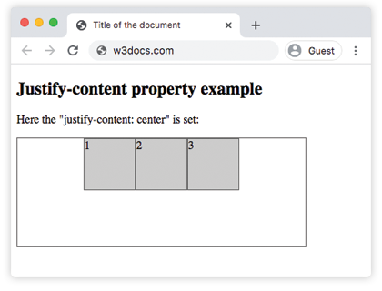
Exemplo da propriedade justify-content com o valor "flex-start":
Exemplo CSS justify-content flex-start
<!DOCTYPE html>
<html>
  <head>
    <title>Title of the document </title>
    <style>
      .start {
        width: 400px;
        height: 150px;
        border: 1px solid #666;
        display: flex;
        justify-content: flex-start;
      }
      .start div {
        width: 70px;
        height: 70px;
        background-color: #ccc;
        border: 1px solid #666;
      }
    </style>
  </head>
  <body>
    <h2>Justify-content property example</h2>
    <p>Here the "justify-content: flex-start" is set:</p>
    <div class="start">
      <div>1</div>
      <div>2</div>
      <div>3</div>
    </div>
  </body>
</html>Exemplo da propriedade justify-content com o valor "flex-end":
Exemplo CSS justify-content flex-end
<!DOCTYPE html>
<html>
  <head>
    <title>Title of the document </title>
    <style>
      .end {
        width: 400px;
        height: 150px;
        border: 1px solid #666;
        display: flex;
        justify-content: flex-end;
      }
      .end div {
        width: 70px;
        height: 70px;
        background-color: #ccc;
        border: 1px solid #666;
      }
    </style>
  </head>
  <body>
    <h2>Justify-content property example</h2>
    <p>Here the "justify-content: flex-end" is set:</p>
    <div class="end">
      <div>1</div>
      <div>2</div>
      <div>3</div>
    </div>
  </body>
</html>Exemplo da propriedade justify-content com o valor "space-between":
Exemplo CSS justify-content space-between
<!DOCTYPE html>
<html>
  <head>
    <title>Title of the document </title>
    <style>
      .space-between {
        width: 400px;
        height: 150px;
        border: 1px solid #666;
        display: flex;
        justify-content: space-between;
      }

      .space-between div {
        width: 70px;
        height: 70px;
        background-color: #ccc;
        border: 1px solid #666;
      }
    </style>
  </head>
  <body>
    <h2>Justify-content property example</h2>
    <p>Here the "justify-content: space-between" is set:</p>
    <div class="space-between">
      <div>1</div>
      <div>2</div>
      <div>3</div>
    </div>
  </body>
</html>Exemplo da propriedade justify-content com o valor "space-around":
Exemplo CSS justify-content space-around
<!DOCTYPE html>
<html>
  <head>
    <title>Title of the document </title>
    <style>
      .space-around {
        width: 400px;
        height: 150px;
        border: 1px solid #666;
        display: flex;
        justify-content: space-around;
      }
      .space-around div {
        width: 70px;
        height: 70px;
        background-color: #ccc;
        border: 1px solid #666;
      }
    </style>
  </head>
  <body>
    <h2>Justify-content property example</h2>
    <p>Here the "justify-content: space-around" is used:</p>
    <div class="space-around">
      <div>1</div>
      <div>2</div>
      <div>3</div>
    </div>
  </body>
</html>Exemplo da propriedade justify-content com o valor "space-evenly":
Com space-evenly, os espaços antes do primeiro item, entre cada item e após o último são todos iguais. (Com space-around, os espaços externos têm metade do tamanho dos espaços entre os itens, enquanto space-between não tem espaços externos.)
<!DOCTYPE html>
<html>
  <head>
    <title>Title of the document </title>
    <style>
      .space-evenly {
        width: 400px;
        height: 150px;
        border: 1px solid #666;
        display: flex;
        justify-content: space-evenly;
      }
      .space-evenly div {
        width: 70px;
        height: 70px;
        background-color: #ccc;
        border: 1px solid #666;
      }
    </style>
  </head>
  <body>
    <h2>Justify-content property example</h2>
    <p>Here the "justify-content: space-evenly" is used:</p>
    <div class="space-evenly">
      <div>1</div>
      <div>2</div>
      <div>3</div>
    </div>
  </body>
</html>Pontos importantes
justify-contentnão faz nada a menos que o pai seja um contêiner flex ou grid (display: flex/display: grid).- As três palavras-chave "space" diferem apenas nos espaços externos:
space-betweennão tem nenhum,space-arounddá espaços externos com metade do tamanho,space-evenlytorna todos os espaços iguais. - O eixo em que atua segue flex-direction. Mude para
columne o mesmo valor funciona de cima para baixo. - Só importa quando há espaço livre restante. Se os itens já preenchem (ou transbordam) o eixo principal, não há nada a distribuir.
Valores
| Valor | Descrição | Experimente |
|---|---|---|
| flex-start | Os itens começam pelo início do contêiner. | Experimente » |
| flex-end | Os itens são posicionados no final do contêiner. | Experimente » |
| center | Os itens são posicionados no centro do contêiner. | Experimente » |
| space-around | Há espaço antes, entre e depois dos itens. | Experimente » |
| space-between | Há espaço entre os itens. | Experimente » |
| space-evenly | Há espaço igual antes, entre e depois dos itens. | Experimente » |
| initial | Define o valor padrão da propriedade. | Experimente » |
| inherit | Herda a propriedade do seu elemento pai. |
Prática
Propriedades relacionadas
- align-items — alinha itens ao longo do eixo transversal.
- align-content — espaça linhas flex encapsuladas ao longo do eixo transversal.
- flex-direction — define qual eixo é o eixo principal.
- The Ultimate Guide to Flexbox — o modelo completo do Flexbox em um só lugar.